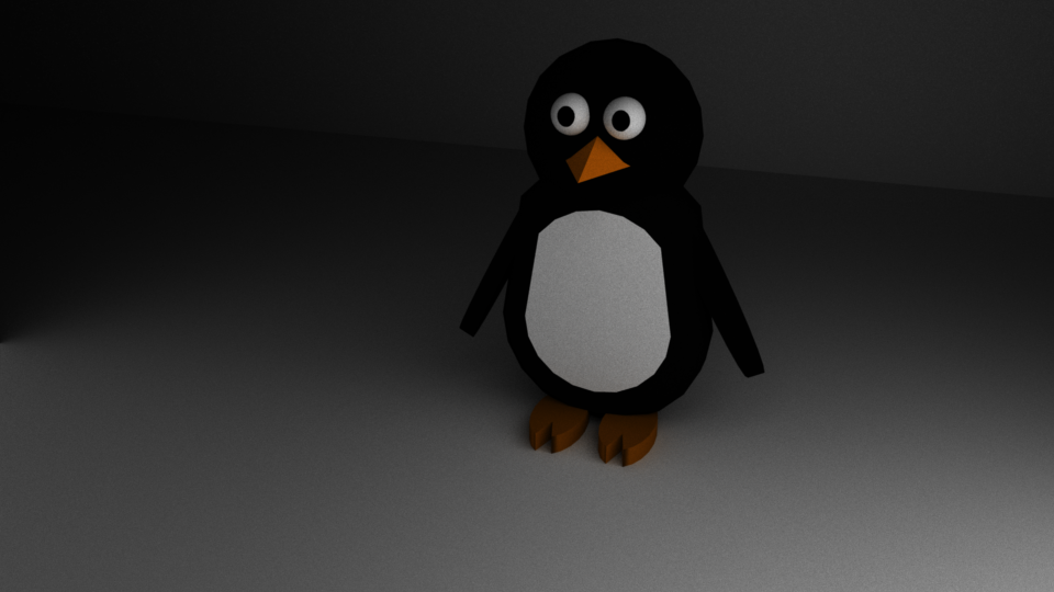
Over the last month I have been working on a walking animation, this has been a lot of trial and error to get this right but I ended up really liking what I had done overall, especially for a first proper attempt at one. What I had learned from the walking animation is that it is not only the legs that move when a character is walking, every part of the body must move as it would in real life. This also adds to the principles of animation as it helps it look more flued and cute.
I created this animation using point to point, the first thing I animated was the legs. I put in the key poses, and then added the inbetweens later to make it look more smooth flowing.
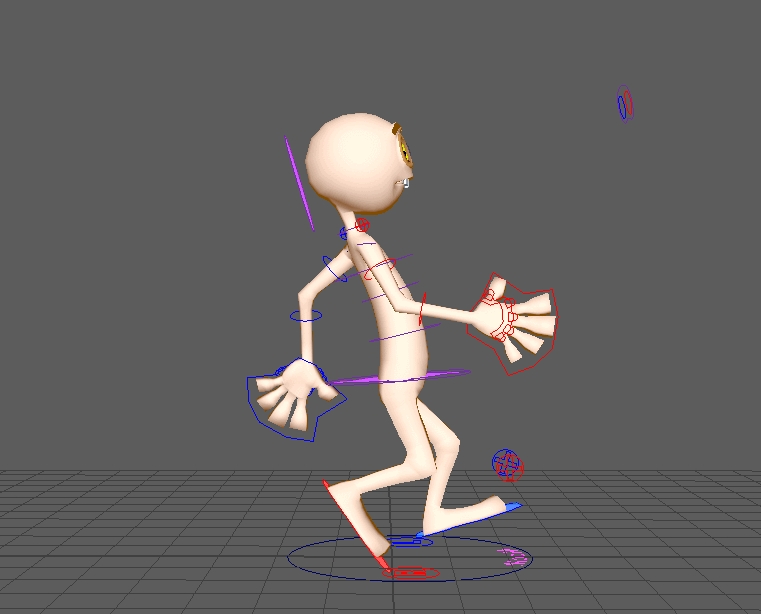
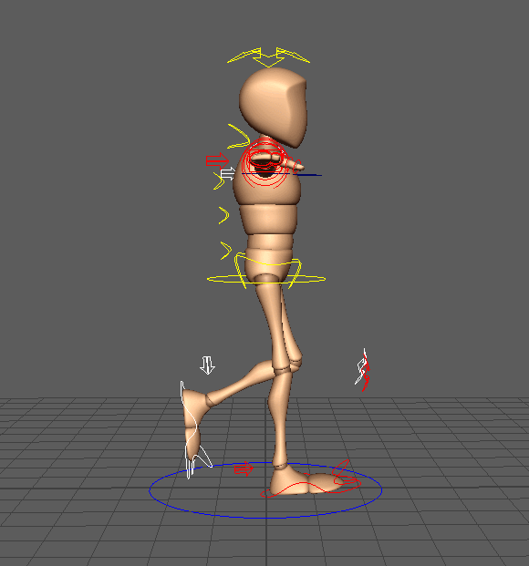
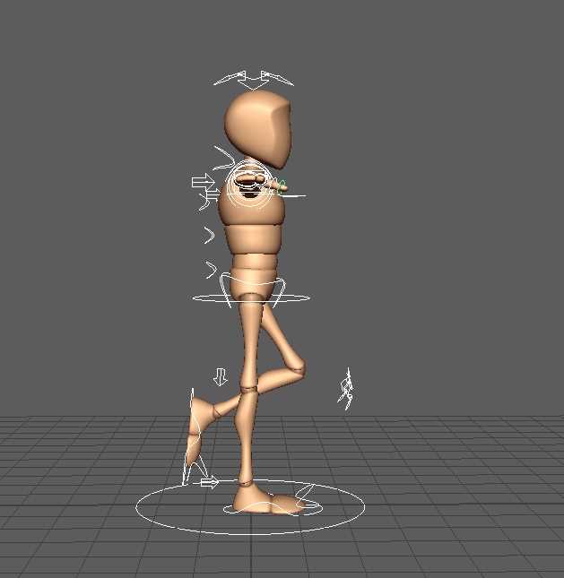 I then did the same with the arms and legs however I forgot to animation block these without the inbetweens. Below is screenshots of what the animation looked like when it was half done, I had added the inbetweens and also added motion to the arms, hands, torso and head. One key thing that I had learned from my research is that the head moving up and down is essential to make it look realistic, as if someone was walking there head would not stay still, same goes for the rest of the body.
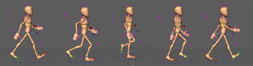
This is a playblast of what it began to look like.
This animation took me more than three attempts to get right as there was a lot of trial and error involved. The first major problem I had was a trying to use the Moom rig which for some reason kept deleting my key frames, however once I got it working I had noticed that I got the timing way off and it ended up looking ridiculous.
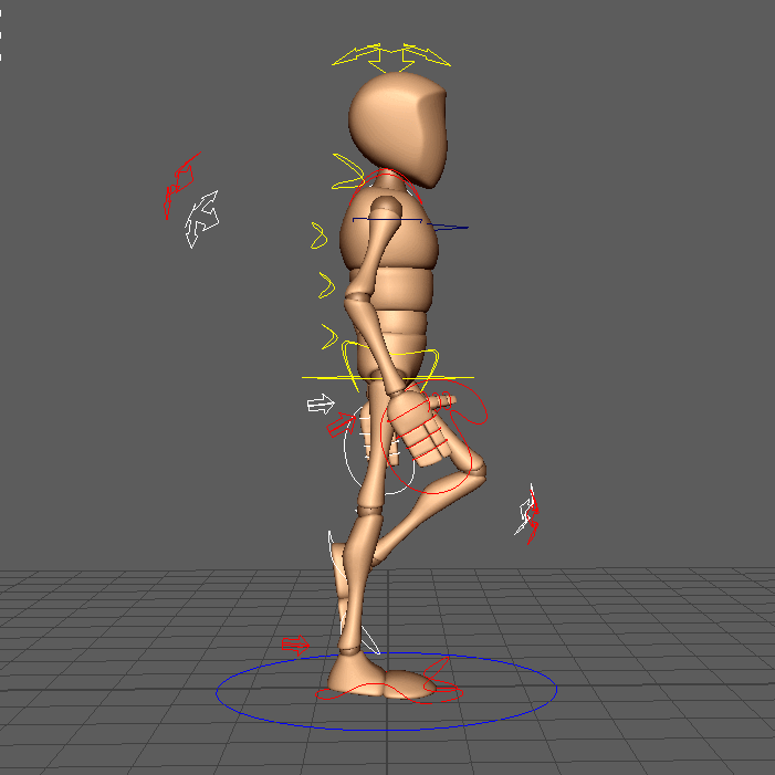
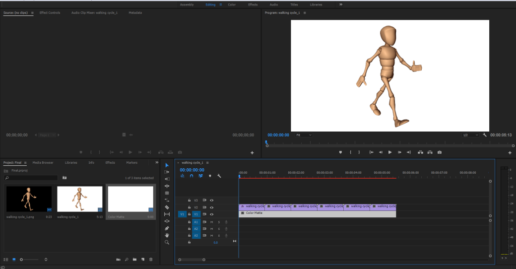
Nearer the end of the production of the animation I ended up tweeking a few things such as making the arms move more exaggeratedly so that he looked more enthusiastic, it also added to how well the animation flows. Once I was happy I batch rendered frames 1 to 23 using turtle; I had also placed some lights into the scene. I then imported these images into premier and added a white background in that as it has the same affect.
If I was to go back and re do this animation I would add more of a swing into his arms to make him look even happier as my goal was to make him express happiness, I would also add a slightly bigger spring into his step. When it comes to rendering I would also render having shadows turned on for that extra piece of detail. Within this animation I think I have hit many of the principles.
 The graphics for resident evil 7 console for this game look amazing but they are slightly restricted due to it being on console but the game can be played in full HD on powerful PC’s. Developers always give PC players the option to change all the graphics settings as it depends on the persons PC. Whereas you do not have these settings on console because they are capped. Resident Evil 7 was also made to be used with Playstation VR. The graphics did decrease significantly and the game only works with looking around however due to it being a horror game this was an amazing touch. You can feel immersed into the atmosphere and the environment that the developers intended you to be sucked into.
 Resident Evil 5 & 6 was a very low point for the franchise as the devlopers went for more of an action approach to try and stay up to date with other shooters. However because of this the franchise started the lose its horror edge. By being able to add more to games due to newer technology this is why the game may have taken a 3rd person appraoch for these titles which may have pushed it towards it losing its scary feel. Resident evil 7 went for a compelty new approach which shocked its primary audience as it did not look like the typical game; but it paid off in the end.

![Star wars].PNG](https://joshforrestnextgen.wordpress.com/wp-content/uploads/2017/04/star-wars.png?w=1040)