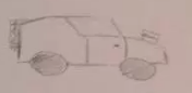
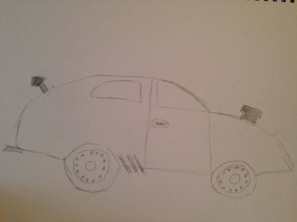
A couple of months ago I completed a project called “Thinking Inside the Box”. Upon the completion of this task I was given feedback on my modelling, texturing and rendering. I have been trying to use this feedback on created models to try and better my skills within Maya and also Photoshop. One of the primary things I have been doing is trying to round my objects a bit more with a bevel as most objects in real life don’t have perfectly strait edges. I have also been UV unwrapping all of my models so that I can create better looking textures. Once in Photoshop I have also been trying to layer some of my textures and I have also been using the blending and recolouring functions to make the textures look better than the source images. Rather than improving my old room I have decided to create a new room that will have a theme. The reasoning behind this is that I had a lot of fun creating my old room however I got a bit bored of what I had chosen to do. I also think that I could compare my old room to my new room to show how my skills may have developed. For this new room that I have began to create I have chosen to go with a medieval theme as I have a pretty good idea on what I can model and how I can model it. Texturing will also be quite fun, however I will have to make sure everything fits with the design and colour scheme so the models in the environment will flow well together.
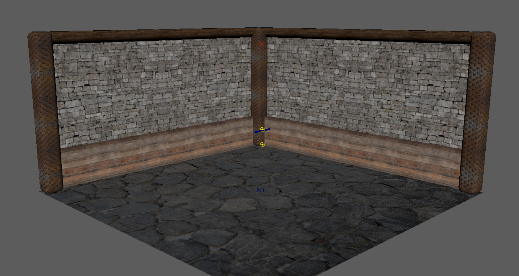
The first major change I have made from my original room is that I have removed two walls, of course in a full room they would be there however for the purpose of this I have chose to leave them out as I think it will allow me to create a much nicer render when I have my finished product. For the corners of the room I have chosen to make wooden beams with engravings that have been textured onto it, I have also beveled them to add a roundness to the beams. Next I created a plane with a stone wall texture on it, this was placed behind the beams and would be the main part of the wall. The stone and wood mix also goes with the theme. So that the wall did not just look flat like my previous room I chose to add in a cube and then resize and texture this into wooden planks that would differentiate from the colours of the beams to add an extra layer of detail. The fact that the walls of the room are not flat makes them look far better in my opinion. The floor was very simple to create as this was just a plane with a stone floor texture stuck on it, however the original texture was very bright so I changed this in Photoshop to be darker to fit with the tone. Finally for the rooms walls I inserted a cylinder that I removed three quarters of. I then UV unwrapped and textured this to look like a dark log. This looked like the same colour as the beams however looked more rugged as it did not have the engravings in them. Overall I did not have many problems with the creation of the walls and floor of my room, however it did take some time as I want it to look detailed.
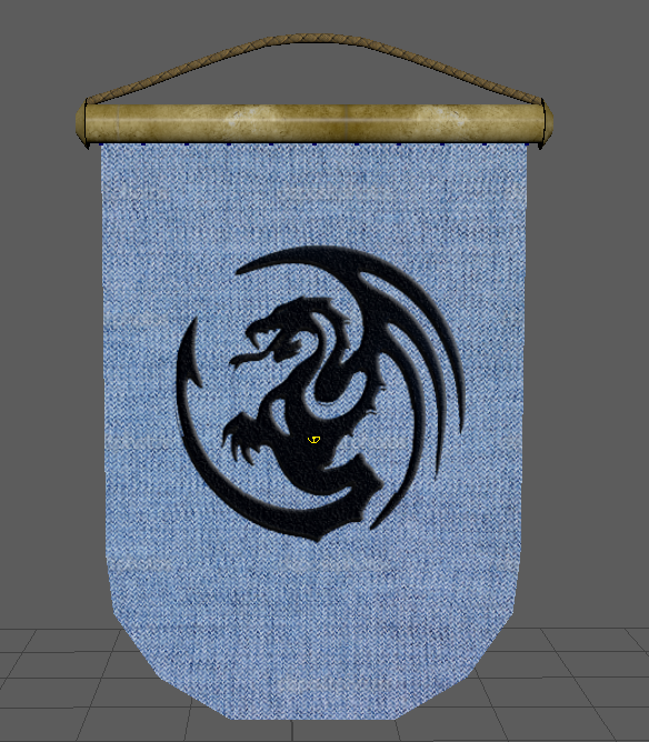
I built the shell of the room yesterday however today I began to create some objects to try and fill the room, the first thing I chose to create was a banner to go on the wall. When creating the banner I took inspiration from the house banners in game of thrones. The banner was split into three separate objects, the banner flag, the pole and the rope. The flags texture was pretty easy to create as it consisted of a nice blue cloth texture that I had found online. I then inserted the dragon and removed the background. I then blended this in and added a texture to that layer so that the logo did not just look like a black dragon had been printed onto it but rather sewed into it. This also adds to the realism of the theme I chose. The rope and pole simply just had images sourced and placed onto the texture files. I also added an nCloth to the flag so that it looks more realistic as it has physics.
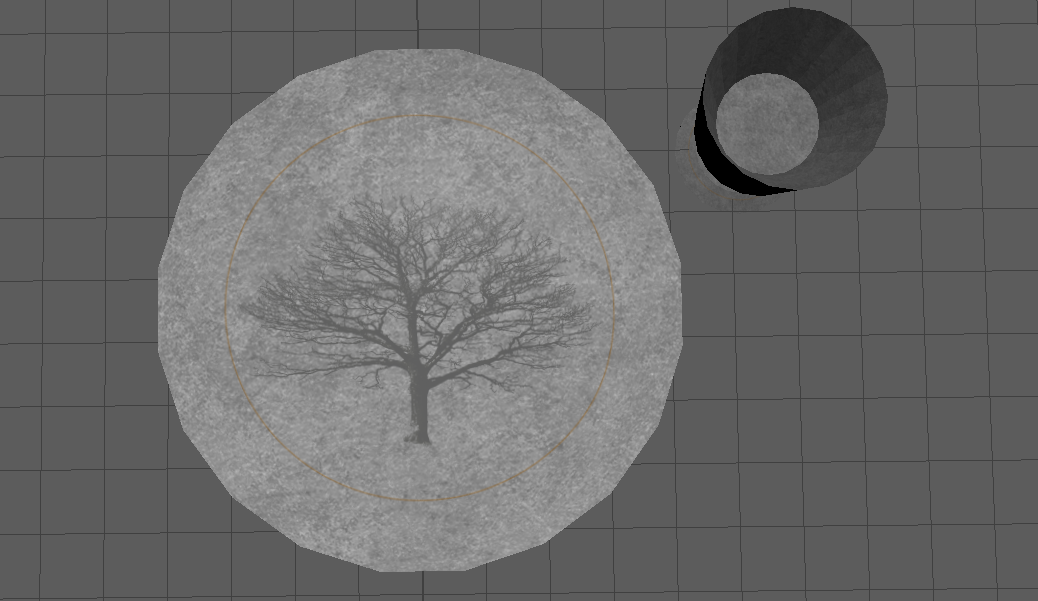
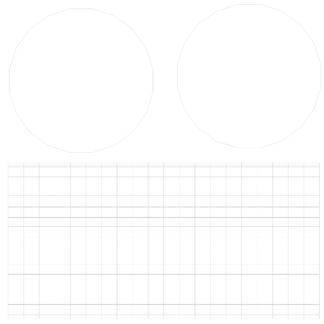
UVs –
This slideshow requires JavaScript.
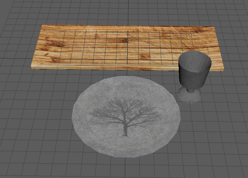
Textures –
This slideshow requires JavaScript.
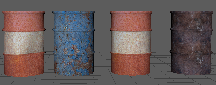
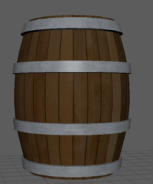
Next I created a barrel. I had a moderate problem with the creation of this as it took me a while to get the UVs laid out well enough to be able to export and texture them. This was easy to make as I inserted an image of a barrel onto the plane and simply traced it. Rather than texturing at all separately I created two different textures. One with the metal and one with the wood. I then simply created two shaders and selected the specif faces on the model that would be that texture. For the barrel it’s texture was wooden planks with metal hoops around it.
This slideshow requires JavaScript.
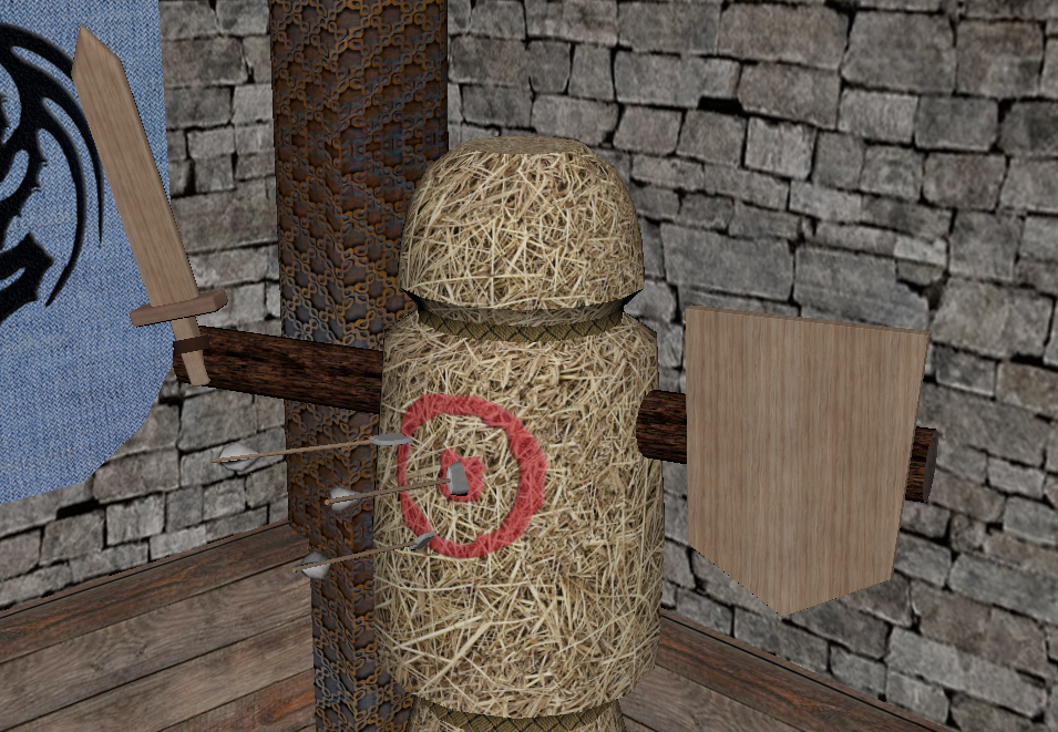
The most recent thing that I have created for the scene is a straw training dummy that knights and similar characters would have used to train before battle. This seemed like a very good object to model for my room as it is fitting. The object is split into three parts, the arms the body and the stand. The body is the part of the object that looks like straw I also painted a target onto it to make it look more authentic. I also created a straight cylinder which would act like the arms. this had a log texture around the edges and the inside was like the inside of a tree. Finally I created the stand which had a metal base and a log pole inside of it. This is what the body is propped onto.
This slideshow requires JavaScript.
This slideshow requires JavaScript.
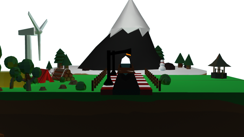
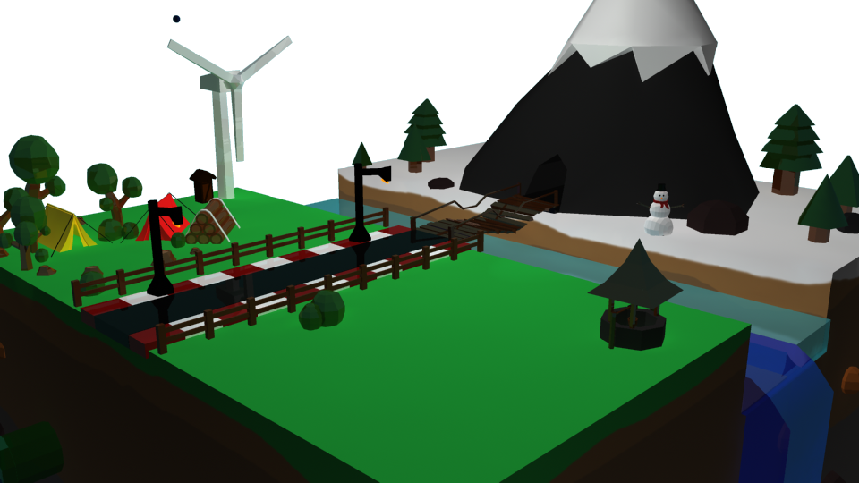
This is the scene so far.